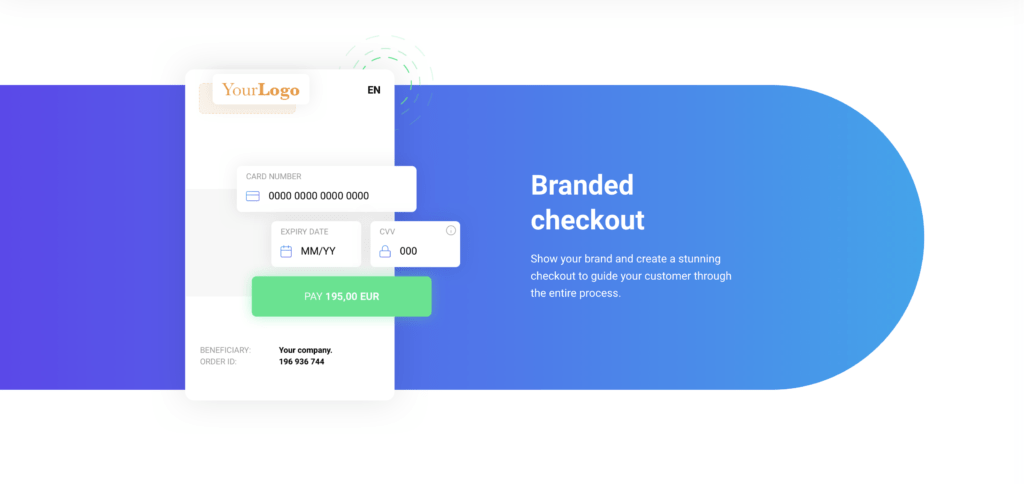
Optimising the payment page
Cart abandonment is still an ongoing battle for merchants, with an alarmingly high 80% average dropout rate at the payment checkout page. It’s essential to create a smooth and seamless customer experience at the checkout to diminish the number of customers who drop out at the last minute.
Once customers get to the payment checkout page, they’ve decided to buy – all they need to do is complete the payment process. While it seems a simple step, cart abandonment is still an ongoing battle for merchants, with an alarmingly high 80% average dropout rate at the online checkout.
Payment page versus cart abandonment
The reasons for cart abandonment are many and varied, but some of the most common reasons given by shoppers include hidden shipping costs, the need for customer registration, a lack of trust in the payment page and overly complex checkout processes.

While you can’t entirely prevent cart abandonment, (there will always be customers who simply change their mind, for instance) there is a great deal that merchants can do to reduce it and, in doing so, increase conversion rates. The first – and perhaps the most fruitful step – is to optimise the checkout experience.
Tips for creating a conversion-boosting payment checkout process
To give a better chance of moving the customer through the checkout successfully, merchants need to create a checkout process which is convenient and trusted. Often, merely simplifying the process can help significantly. The payment page must be clear, straightforward, easy to complete and avoid giving customers any reason for hesitation or doubt. Here are our top tips for creating a frictionless, conversion-boosting checkout process.
-
Keep the payment page simple
- Ensure the payment page is optimised for each device type (smartphone, tablet, computer etc.), so customers have a clear view of everything in one place.
- Avoid visible or awkward page redirections – they risk technical glitches and customer uncertainty.
- Minimise the number of fields on the page or steps in the checkout process.
-
Deliver convenience and choice
- Support a relevant range of payment methods; ideally, the top three preferred methods in each market.
- Offer one-click payment options for returning customers.
- Implement a guest checkout option for new customers, with the chance to create an account after the transaction is completed.
-
Inspire trust
- Make sure pricing is transparent ahead of the final checkout, including listing any shipping costs.
- Use low-friction, trusted customer authentication methods where possible.
- Assure customers that their payments details are being protected.

-
Put your stamp on it
- Employ a consistent look and feel throughout the process.
- Customize your payments page to make sure it is a fitting part of your brand experience
- Work with your payment provider to capture exactly the right data and personalize for your customers where possible.
These simple steps can help you create a smoother, more seamless customer experience at the checkout, which in turn can help you boost conversion and reduce the number of customers who drop out at the last minute. The more at ease your customers feel when they reach the payment page, the more likely they are to complete their transaction.
If you are looking for a customized, modern payment page or want to find out more, get in touch at sales@trustpay.eu
